3 display modes to comprehend and optimize your territory breakdown

Do you need to create or optimize your sectorization? These 3 approaches to setting up your map displays will produce analyses that drive their message home, and help you in your calculations to make sectors more balanced, more equitable, and your assignment of sectors fairer and more astute.
We can achieve a lot of useful things with a spreadsheet, but when it comes to territory sectoring, nothing beats a visual representation. Whether we are aiming to analyse key indicators, compare breakdown hypotheses, balance the portfolios of our sales reps, or scrutinise the affiliation of zones to technical staff working to service clients in a particular area, a good map will save you hours of data manipulation, and very often errors of interpretation. Clearly we need to agree about what constitutes ‘a good map’. The answer is simple: it is a map that delivers an immediate message, because the display mode is well matched to the question under the spotlight, and deploys graphics conventions (symbols, colours) that the human brain can grasp efficiently and rapidly. Here are two examples.
Heat maps: the perfect tool for seeing exactly where your sales potential lies
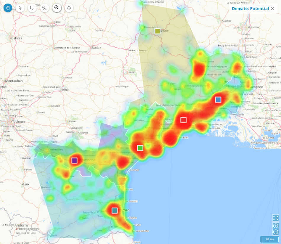
Sales potential is one of the indicators that is vital when building a balanced sectorization. Let’s assume you’ve already calculated this indicator – typically by applying a coefficient to revenue achieved with each client over the last 12 or 24 months. You have values in euros, but your beloved spreadsheet tells you absolutely nothing about how this potential is distributed spatially. Representing this indicator in the form of a heat map reveals what you need to know in a spectacular way. As this convention is one we have all come across at some time or other – a colour gradient ranging from red to pale blue (hot to cold) – this type of map can be interpreted at a glance by anybody: the deeper the colour red, the higher, and more concentrated, is the revenue potential.
What is immediately striking In the example map above, is the unequal distribution of potential over the territory in question, with zones of high concentration along the coast, and then a large patch to the North where there is no colour at all. Beware of jumping to the conclusion that you have few clients in this area, as it could mean simply that the potential there is low. If, on this same map, you were to show where sales personnel actually lived (home locations for staff here being shown as a series of squares) you can immediately see that the person who lives in Mende is at a significant disadvantage in comparison with his colleagues living in Nîmes, Montpellier and Béziers.
Spider maps quickly identify where the snags lie
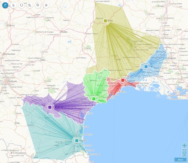
This type of display highlights the links between client locations and their nearest branch or office of affiliation, or the location and distance away of the sales representative who services their business. Plotting a straight line between each client/point of sale and the resource assigned to them results in a spider map with tentacles that may be shorter or longer, and more or less dense and polarised. This is an excellent entry point when it comes to spotting imbalances between sectors, and seeing which affiliations need tweaking to reduce disparities for members of your team such as the number of clients serviced and/or the distances staff need to travel in order to visit them.
In the above example, the spider maps have strikingly different morphologies. That of the Montpellier office/outlet is extremely compact, unlike those for the offices in Perpignan and above all, Mende. We can see immediately from the length and orientation of the ‘stings” that this office mainly services clients situated more than 50kms to the South West, and, moreover, that clients are located at some distance from one another. For technical staff working this sector, there are a lot more kilometres to cover each day, and, when you take into account the journey times between client sites, it is clear that for anyone working this territory, less interventions will be possible each day. This situation may have a historical explanation: the company might very well have set up the Mende office 15 or 20 years ago, and the headquarters then moved to Montpellier subsequently, and the Mende office location has never been reviewed since. In view of the current locations of existing clients, it would be more practical to have an office in the South of the sector, at Alès for example. If this option is not feasible, another option would be to boost the staff headcount in Nimes and Montpellier, and reassign clients located the furthest to the South of the current Mende sector to these offices.
A representation in the form of a spider map can give shape to hypotheses you would probably never have envisaged if working with text and lists of customers and resources. Of course, further down the line, you will have to test your hypotheses, bringing into play yet more parameters, such as revenue potential, the number of regular visits required annually, or the duration of different types of intervention at clients’ sites. This is what our Territory Manager solution is designed to do for you, providing access at every step along the way of the design process to multiple display modes for displaying your data. Heat maps and spider maps are among them. No need for you to master any complex procedures: these maps are generated automatically, and if the form is not suited to what you need to see and analyse, the solution points this out and suggests a more pertinent display mode.
Dynamic gauges for refining and balancing “by eye”
Optimizing a sectoring will always be an exercise in balancing and applying multi-criterion weightings. This can rapidly get complicated. When you adjust one parameter – for example, the number of clients – you will unbalance another parameter, for example travelling time… To ensure you always have a clear view of the impact your choices will have, Territory Manager associates your sector map with the representation of the chosen key variables in the form of dynamic gauges.
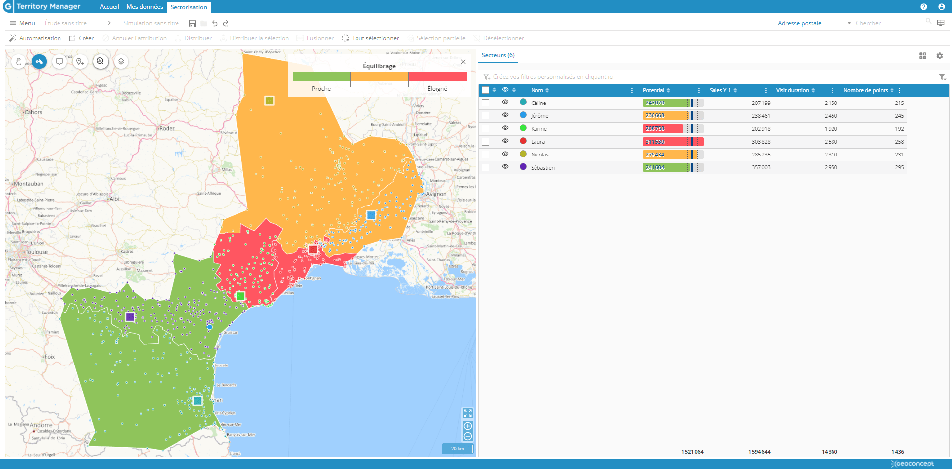
In this example, we are aiming to balance portfolios for sales reps in terms of sales potential. In this particular scenario, revenue potential should fall within the range of 270,000 to 280,000 euros. These thresholds are materialised in the gauge, and in the map, through colour variation. So the gauge and sector for Karine, well below the minimum, appears in red, as does that of Laura, which is well above the maximum. As the sectors of these 2 sales staff are adjoining, we can correct the imbalance by reassigning clients from Laura to Karine. This operation can be performed client by client on the map, until the displays change to green. If the potential for clients reassigned to Karine turns out to be lower than required, the gauge and the sector will display in orange. To adjust them so they become green, we can assign some of the clients serviced by Nicolas – whose sector is right next to Karine’s, but for whom the potential is close to the predefined maximum. Once these manual reassignments have been made, the gauges and sectors of all three sales personnel will be green and their borders will have been automatically redrawn on the map.
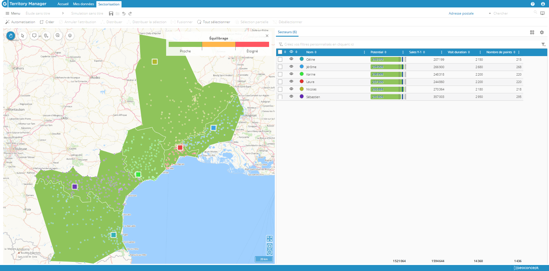
The user might equally opt for the colour of indicators to change as a function of variations in relation to the mean, rather than of potential in terms of euros:
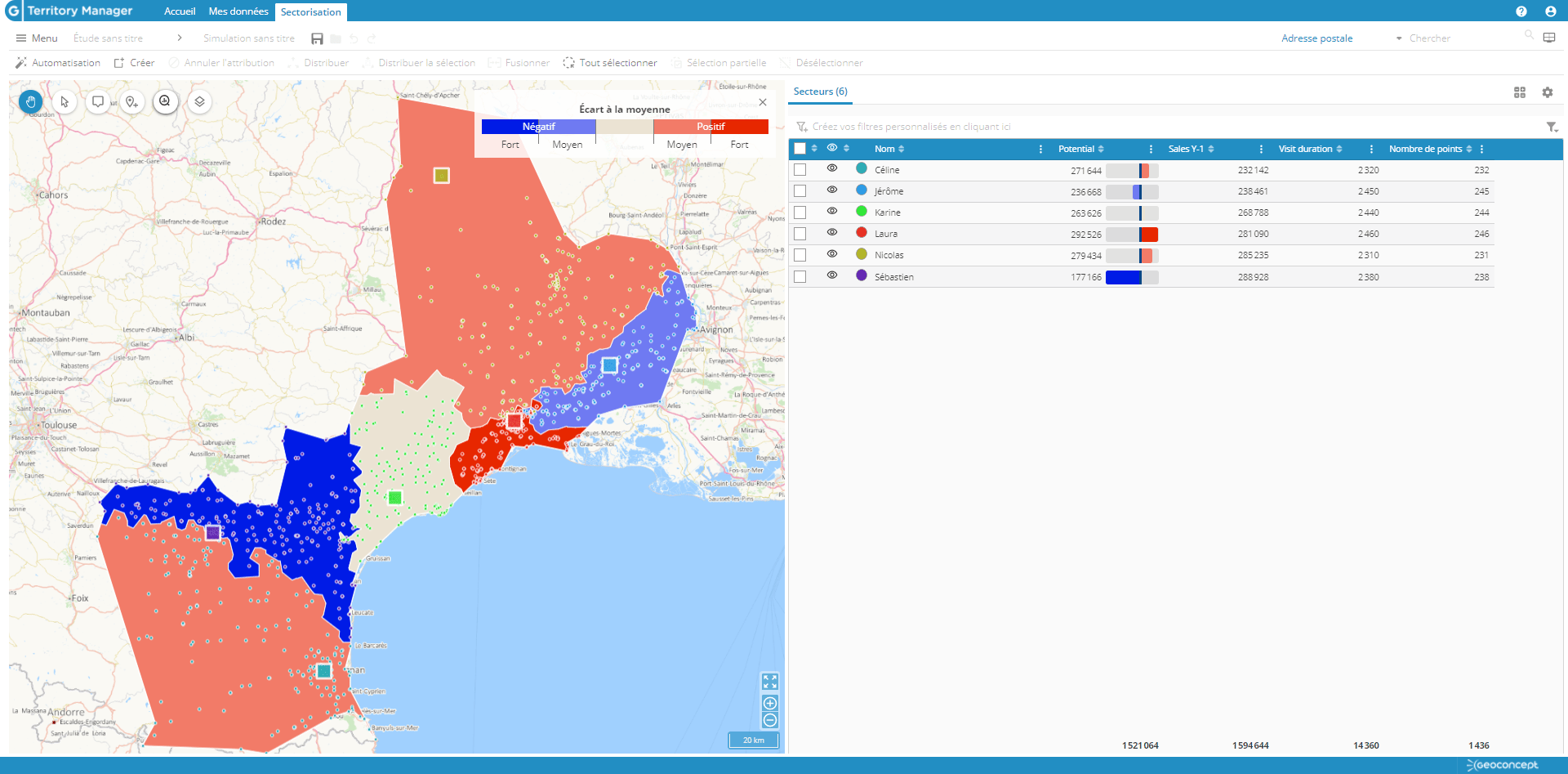
Combining method and rigor with intuition, this visual and dynamic approach allows us to balance sectors with a high level of precision. Whether you start from an existing sectoring, or the default ’blank page’ territory breakdown generated by the application, fine-tuning in this way is vital if you are to arrive at an optimum solution. Not only will sectors and portfolios be balanced in terms of both potential and work load, but your solutions will be infinitely more acceptable to those impacted by the very fact of your having taken their interests and knowledge of the sector into account in the process, along with the constraints specific to their work configuration and the terrain.
